
Mathematics for IGCSE & O level - Statistical Diagrams (Section 4 - No. 46)
In the pie chart, the sectors represent the age groups. If the sector size is proportional to the frequency, which age group has the largest size? 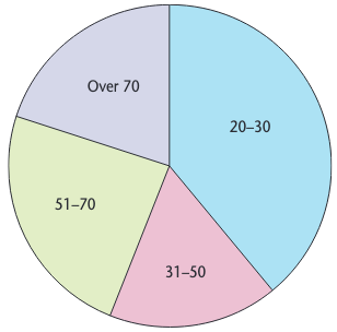
Under 12
12-18
19-30
Over 30
Forklaring
The largest sector corresponds to the highest frequency, which visually appears to be the 12-18 group.